Skip to Content

ClimbUK brand centre

Every part, live

35 components, from a single sticker to a full ticket section. Each one is plain HTML and CSS: switch the theme, try it at phone width, then copy the markup.

Foundations

Foundations

Presets

The five grounds, each with its own text, link and button colours

Open full size (opens in a new tab)

The five presets are the only grounds a ClimbUK section uses. Each one sets the heading, body, link, accent and button colours together, so a section never mixes them by hand.

How to use it
Preset Ground Use
1 White Reading-heavy pages, forms, the release ladder
2 Light Grey A quiet change of pace between dark sections
3 Dark Brown The default ground
4 Climb Orange Calls to action and the close, large white text only
5 Charcoal Tickets and audience sections

Add the class climb-p1 to climb-p5 to a section. In this hub, sections on presets 1, 2, 3 and 5 follow the theme toggle; preset 4 and photo sections stay as they are in both themes.

Foundations

Headline

Uppercase display lines with one orange word and one italic word

Open full size (opens in a new tab)

Headlines are the poster voice: uppercase, tight, and short enough to read in one look.

How to use it
  • climb-display for the one hero line on a page; climb-statement for section lines; add climb-statement-sm for a smaller one beside a photo.
  • Give one word climb-accent (orange) and one word <em> (italic). Never more than one of each.
  • climb-ruled adds the short orange rule above the line.
  • climb-eyebrow sits above a headline: edition, date or audience.
  • climb-lead is the promise line under it, at most 36 words.

Foundations

Eyebrow

Small uppercase labels and the orange rule

Open full size (opens in a new tab)

The eyebrow is the small uppercase line above a headline: the edition, the date or the audience. Keep it under six words. Use climb-ruled on the headline for the short orange rule.

Foundations

Elevation

Shadows and glows from flat to floating

Open full size (opens in a new tab)

Elevation is soft and warm: shadows are Dark Brown, never black, and the pick glows orange. Use the shadow tokens, not your own values.

Foundations

Motion

Rise, spring and the marquee drift

Open full size (opens in a new tab)

Motion is punchy and short: things rise into place, buttons spring, live labels pulse, logos drift. Use the duration and easing tokens. Everything stops or becomes a simple fade under reduced motion.

Actions

Actions

Button

Pill buttons with a spring hover, one primary per view, and the pull link

Open full size (opens in a new tab)

Buttons are pills in Montserrat Bold with an action verb: Get your ticket, Book a call, Apply to speak.

How to use it
  • One btn btn-primary per view. A second action is btn btn-outline-secondary.
  • btn-lg in heroes and closes, the default size elsewhere.
  • A closed offer shows a disabled outline button that says Sold out, only when it is true.
  • The pull link (climb-pull) is the soft third action under the buttons: a question that routes people.
  • On Climb Orange (preset 4) the primary button turns White with Charcoal text.
  • Hover lifts with the spring easing; focus shows a 3px orange outline. Both stop under reduced motion.

Festival devices

Festival devices

Sticker

Tilted stickers that pin to a card or photo corner

Open full size (opens in a new tab)

Stickers are the festival's stamps: one or two words, tilted, pinned to the corner of a photo or a ticket.

How to use it
  • climb-sticker is Climb Orange with Dark Brown text; climb-sticker-dark is Dark Brown with orange text.
  • climb-sticker-pin pins it to the top corner of its card.
  • One sticker per card. Words only, never a sentence.

Festival devices

Tags

Outlined tags for formats and topics, and the live label

Open full size (opens in a new tab)

Tags name formats and topics. They are outlined, never filled, so they do not compete with buttons.

How to use it

The live label (climb-live) adds a pulsing orange dot. Use it only for something that is happening now: tickets on sale, a live stream, doors open. The pulse stops under reduced motion.

Tickets and stands

Tickets and stands

Ticket card

The glass ticket with stub notches, highlighted and on orange

Open full size (opens in a new tab)

The ticket card is the thing people pick up: a glass card with stub notches, a sticker and one button.

How to use it
  • climb-ticket on dark grounds; add climb-ticket-hl for the one ticket to pick (orange edge and glow).
  • On Climb Orange it turns Dark Brown.
  • Kicker, name, three short benefits, one button. Prices go on offer cards.
  • climb-levels lists packages with a note on the right (passes, sizes).

Tickets and stands

Offer cards

Ticket offers: the pick, the rest, and a closed release

Open full size (opens in a new tab)

Offer cards sit side by side so people can compare. One is highlighted, the rest are equal.

How to use it
  • climb-offer-hl is the offer to pick: orange edge, glow and a filled kicker, never raised, so its button stays on the row's line.
  • is-soldout dashes the edge, strikes the price and disables the button. Use it only when that release is truly closed.
  • climb-was shows the full price struck through; climb-remaining shows how many are left, only from live stock.
  • Prices always say inc VAT. No false scarcity: never write last few, hurry or selling fast.

Tickets and stands

Release ladder

Price releases as rising steps: past, now and next

Open full size (opens in a new tab)

The release ladder shows that the price rises with every release, and where today sits on it.

How to use it
  • Each climb-ladder-step sets --climb-step (1, 2, 3 ...) so its cap rises.
  • is-past greys the cap and strikes the price; is-current fills it orange with a glow and the left pill; is-next dashes it.
  • States are written in words as well as shown (Closed, On sale now, Next), never colour alone.
  • On phones the ladder turns into a vertical rail.

Tickets and stands

Stand cards

Exhibition stands with an outlined floor plan and stock

Open full size (opens in a new tab)

Stand cards show the exhibition space. The outlined plan (climb-plan-1, -2, -4) shows the footprint at a glance.

How to use it
  • climb-left shows stock left, from live stock only. A sold-out stand uses is-soldout.
  • Name, size, what is included, price inc VAT, one button.

Tickets and stands

Group offer

The orange band for teams and groups

Open full size (opens in a new tab)

The group offer is one orange band under the ticket offers: bring the team, one line, one Dark Brown button.

Cards

Cards

Moment card

Photo cards for the big moments

Open full size (opens in a new tab)

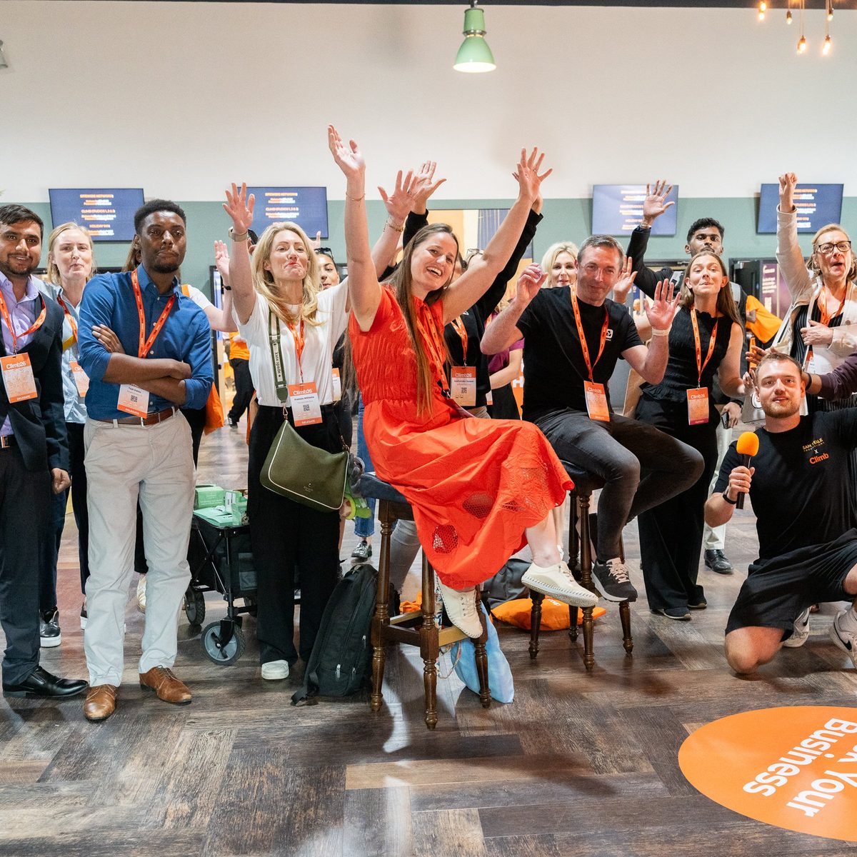
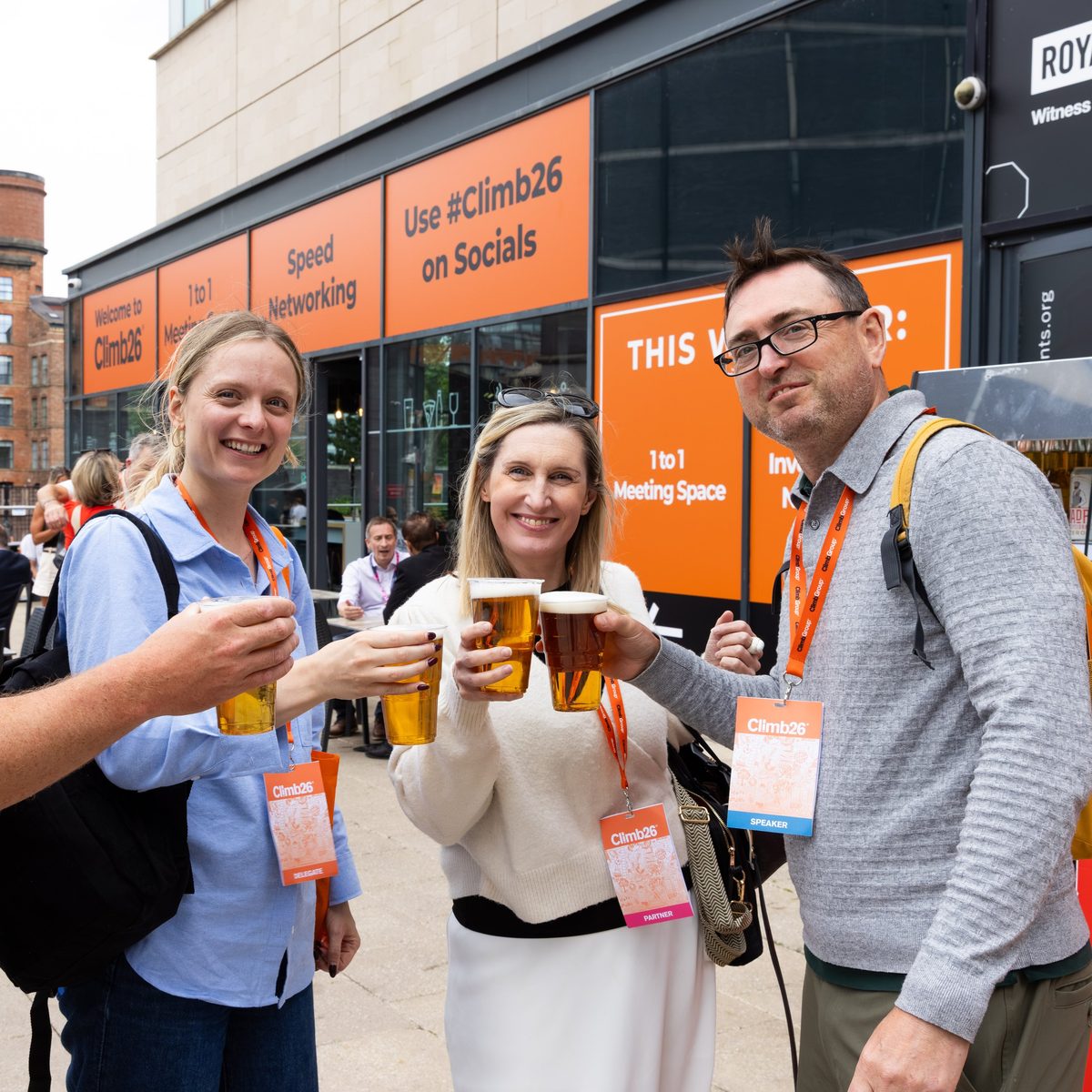
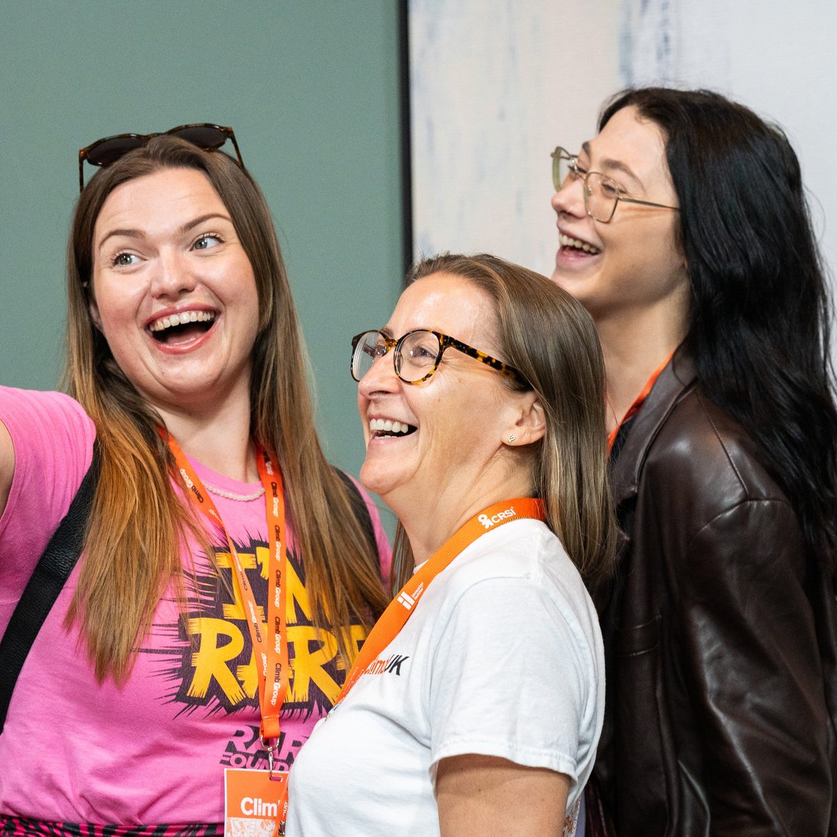
Moment cards show what happens: a real Climb26 photo, a short name, one sentence. Three in a row. Photos lift slightly on hover.

Cards

Audience card

Photo cards that route each audience to its page

Open full size (opens in a new tab)

Audience cards let each audience pick themselves. The whole card is the link. Four in a row on desktop, two on tablets, one on phones. The line under the name is the audience's own reason to come.

Cards

Quote

Testimonials from named, real people

Open full size (opens in a new tab)

Quotes come only from named, real people who agreed to them, with their role and company. Never invent a quote, a name or a company.

Cards

Lineup

A festival poster lineup of names in three sizes

Open full size (opens in a new tab)

The lineup sets names like a festival poster: the biggest names first, three sizes, separated by orange slashes. Only names that are confirmed or that appeared at a past edition, labelled as such.

Sections

Sections

Photo fade

Brown, Heat and Orange fades over Climb26 photos

Open full size (opens in a new tab)

A photo fade puts a real photo behind the words and fades it to a brand colour on the side the words sit.

How to use it
  • Brown: Dark Brown from the left and to a solid foot, so cards can sit on it. The Business with a party section.
  • Heat: Dark Brown on the left, warming to orange light on the right. For the evening and the after parties.
  • Orange: Climb Orange washing over the photo. Never over faces; use objects, stages and crowds from behind.
  • Words sit where the fade is 85% or more. End on solid colour. Flip the fade (270deg) to put words on the right.
  • Photo fades stay dark (or orange) in both themes.

Sections

Hero

Full-bleed stage photo with the poster line

Open full size (opens in a new tab)

The hero opens a page: a full-bleed Climb26 stage photo faded from the left, an eyebrow, one display line, a lead, two buttons and the pull link.

Sections

Hero with ticket

The hero with a glass ticket to pick up

Open full size (opens in a new tab)

The hero with a ticket adds the glass ticket card on the right, for pages built around one ticket.

Sections

Moments

Statement, lead and three moment cards

Open full size (opens in a new tab)

Moments sells the feeling: one statement with an italic word, a lead, three moment cards and two buttons.

Sections

Photo wall

A mosaic of Climb26 photos and two quotes

Open full size (opens in a new tab)

The photo wall shows the last edition: one big tile with a sticker, a wall of squares and two quotes from people who were there.

Sections

Ticket band

Climb Orange band with a Dark Brown ticket

Open full size (opens in a new tab)

The ticket band is the partner pitch on Climb Orange: one big line, a lead, one button and a Dark Brown ticket listing the packages.

Sections

Tickets

Offers, the release ladder, the group offer and the pull link

Open full size (opens in a new tab)

The tickets section is the order on a ticket page: the offers, the release ladder, the group offer and a pull link for anyone still choosing.

Sections

Ticket ladder section

The release ladder on its own

Open full size (opens in a new tab)

The release ladder as its own section, for a pricing page or under a hero.

Sections

Stands

Exhibition stands with plans and stock

Open full size (opens in a new tab)

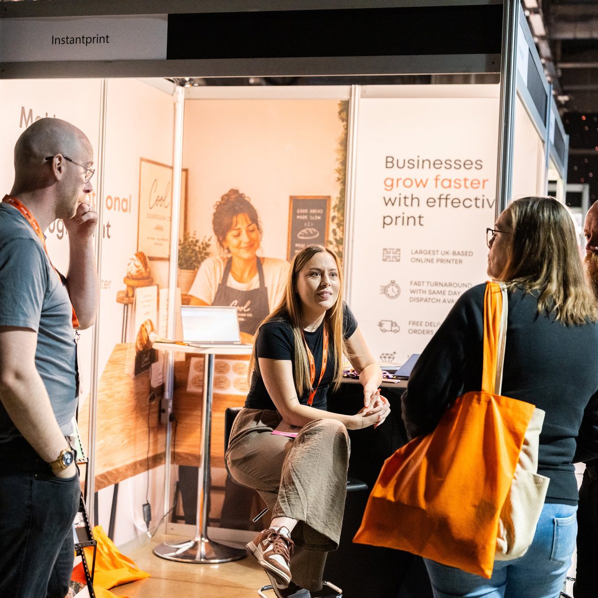
The stands section sells exhibition space with outlined plans and live stock.

Sections

Speaker lineup

Apply to speak, with the poster lineup

Open full size (opens in a new tab)

The speaker lineup invites people to apply, with format tags and the poster lineup of previous speakers.

Sections

Logo marquee

Rows of partner logos drifting past

Open full size (opens in a new tab)

The logo marquee shows partners, exhibitors and attendees as two rows drifting in opposite directions with faded edges. It pauses on hover and stops under reduced motion. Logos sit in a neutral tone and go to colour on hover.

Sections

Audience chooser

Four audience cards on Charcoal

Open full size (opens in a new tab)

The audience chooser asks what brings you to ClimbUK and routes each audience to its own page.

Sections

Moment

A big photo with a sticker and one line

Open full size (opens in a new tab)

Moment is one photo, one sticker, one line and one button. Use it to put one thing in the spotlight, like the ClimbAwards.

Sections

Close

Climb Orange close with the last question

Open full size (opens in a new tab)

The close ends every ticket page on Climb Orange: the last question, the dates and one clear next step in Dark Brown.

Sections

Divider

Rising chevrons between two sections

Open full size (opens in a new tab)

The divider is a low band of rising chevrons between two sections. Match its preset to the section above.

Brand

Brand

Social icons

Round icon buttons for socials and contact

Open full size (opens in a new tab)

Social and contact icons are round buttons: Climb Orange with a Dark Brown glyph, or quiet outlines on busy grounds. Every icon is a link with a text label for screen readers. The PNG set for email signatures is in the Signature downloads.

Brand

Email signature

The full signature block: contact, logo and icons, notice, photo banner, legal line

Open full size (opens in a new tab)

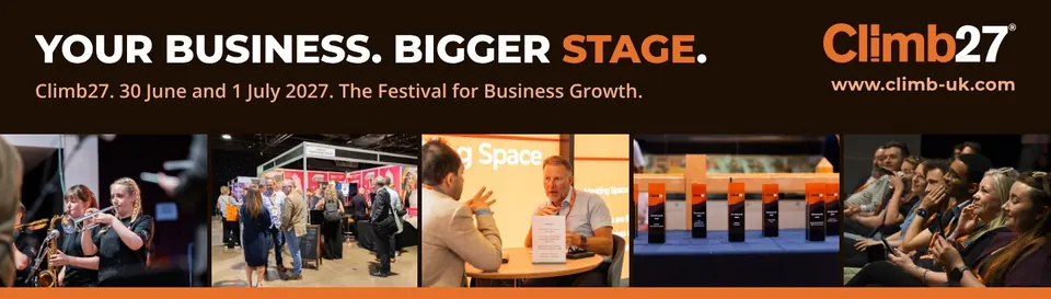
The email signature is one block, top to bottom: the sign-off; name, role, a Book a meeting link, phone numbers, email and website; the logo with a row of outlined social icons on the right; the help note that routes enquiries; the campaign banner; and the confidentiality line. Everything except the logo, icons and banner is live text.
How to use it

It reads on white and on dark mail clients: on white, links are Link on White; on dark, links are Climb Orange and the logo switches to the reversed version (this preview switches with the theme). Download the HTML template, the outline icons and the Email banners. Swap the banner with the campaign and link it to that campaign's page.

Every value on these pages comes from the brand tokens. When the tokens change, these pages change with them.

Get the downloads