
The brand on the poster
It leads on public and audience-facing pieces: the website, social, tickets and the stage.
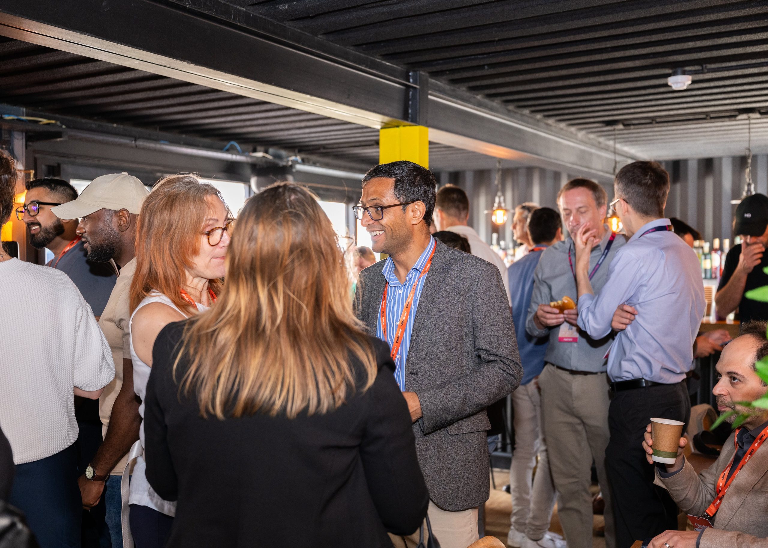
ClimbUK, ClimbGroup and Climb27
Full festival: fun, punchy, exciting. Real crowds under stage light, huge uppercase type with one word in orange and one in italic, stickers slapped on, logos and names drifting past, and Climb Orange that glows. Never a corporate conference look.
The family
It leads on public and audience-facing pieces: the website, social, tickets and the stage.

It leads on event pieces, with ClimbUK as the endorsement.

Footers, legal lines, contracts and corporate decks.
Before anything else
The default ground is Dark Brown, with Charcoal as the second dark ground. White and Light Grey are for reading-heavy pieces: documents, long emails, forms.
One orange button or call to action per section, slide, post or screen. Around it, orange markers are welcome: an orange word, the short orange rule, a sticker, a glow.
Montserrat Bold or Black, uppercase, tight leading. One word in Climb Orange and one in italic per headline. Open Sans for everything people read.
Actual attendees, speakers and stage moments, with consent. Full colour under a Dark Brown fade where text sits. No stock handshakes, empty rooms or generic skylines.
Pick a preset and use its pairs. White on Climb Orange only at 19px bold or larger, 14pt bold in print. Check a pair.
Everything, live
Switch the theme at the top of any page to see the whole book, and every component in it, in Dark, Light, AAA Dark and AAA Light.
Graphic language
Draw it in Climb Orange or as a tone of the ground. Motifs are decoration: keep text off busy areas and never put meaning only in a motif.
Rising steps and stacked chevrons for upward progress. Dividers, corner marks, progress bars.
Topographic rings, as on a climbing map, with one ring in orange. Quiet backgrounds and merch.
Soft beams and glows of orange across a dark ground. Main Stage Moments, screens, heroes.
Dots joined by fine lines, with one orange cluster of three. Find Your People, partners.
A solid orange bar behind one word of a headline: the poster version of the orange word.
Festival devices
These carry the energy. Every one of them is a live component you can switch between themes and copy.
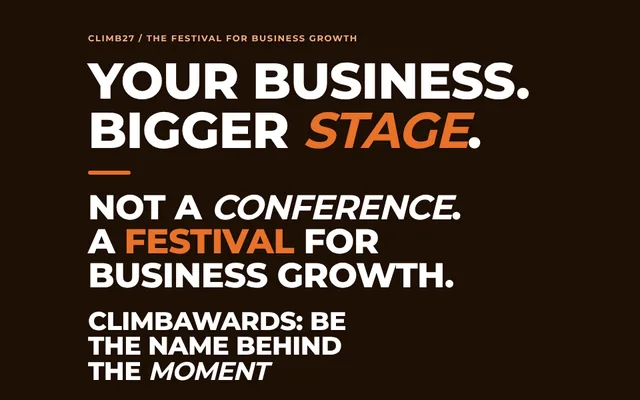 The orange word and the italic wordIn every display line.
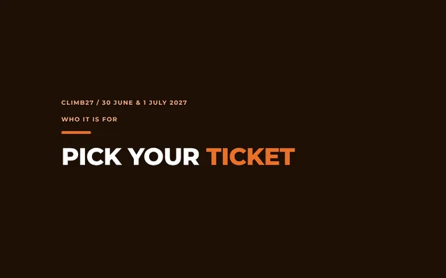 The short orange ruleAbove a statement, with a tracked uppercase eyebrow.
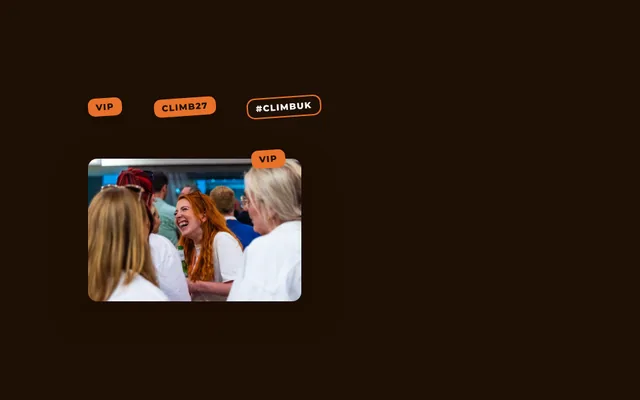 StickersSmall tags tilted a few degrees, pinned to a card corner or a photo.
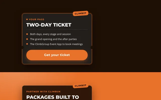 Ticket cardsA dark glass card with stub notches, a tear line and the one button.
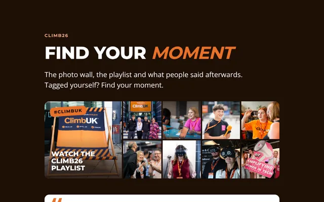 Photo cards and wallsTitle on top, line at the bottom, a Dark Brown fade.
 Lineups and marqueesNames set like a festival poster; logo rows drifting past.
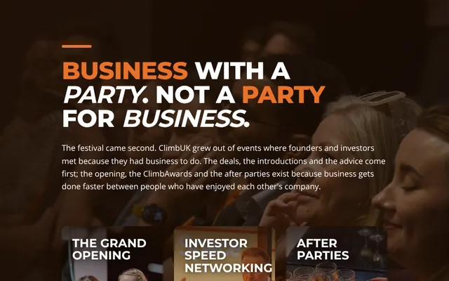 Photo fadesA full-width photo faded to Dark Brown on the words side.
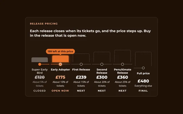 Ticket progressionOffer cards, the release ladder and honest sold-out states.
 SpringCards, photos and stickers lift with a small overshoot when touched.
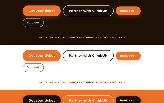 Pull linksA small uppercase line at the foot of a section, handing the reader on.
Voice